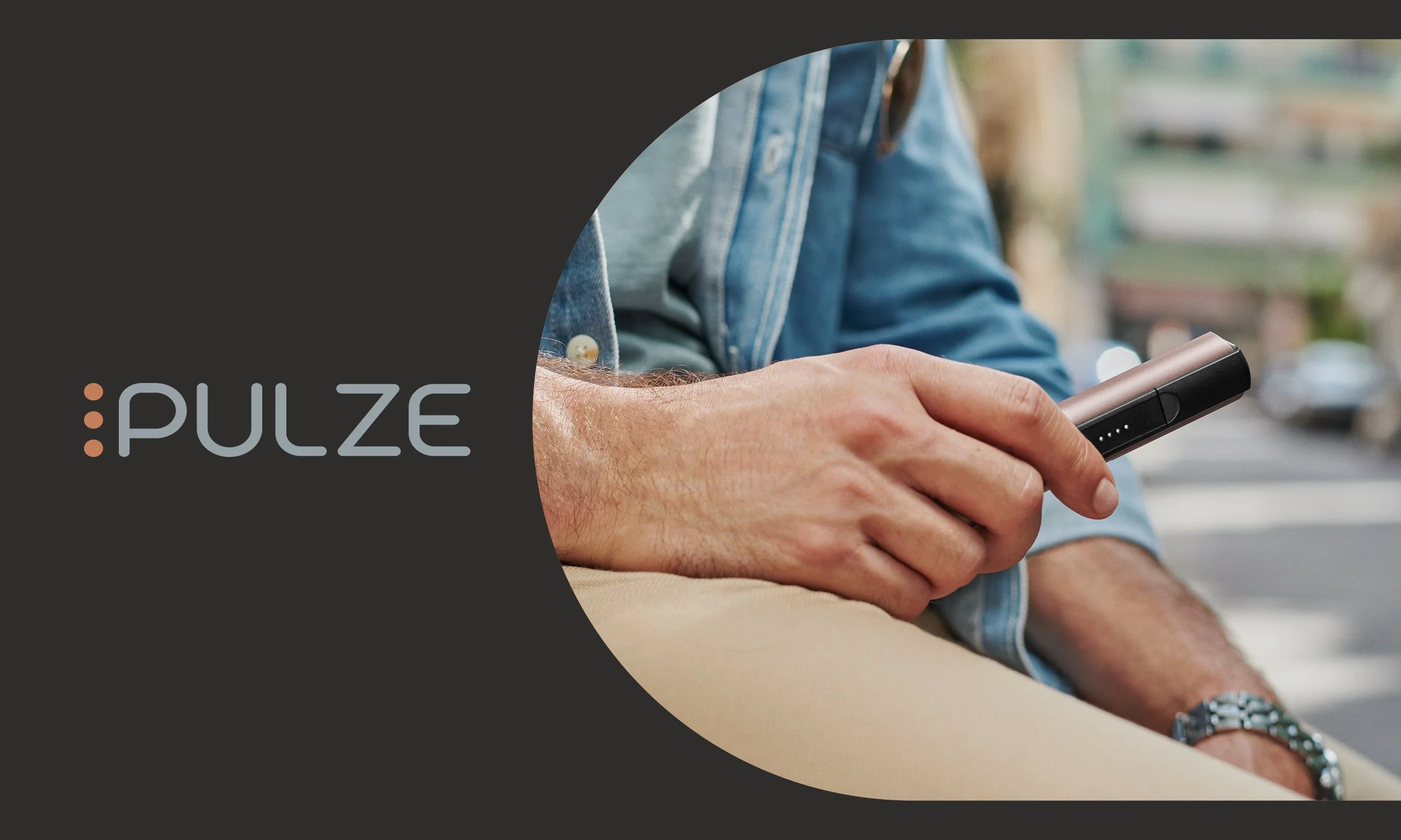
Pulze
Identity | Web Design | Social Media | eCRM
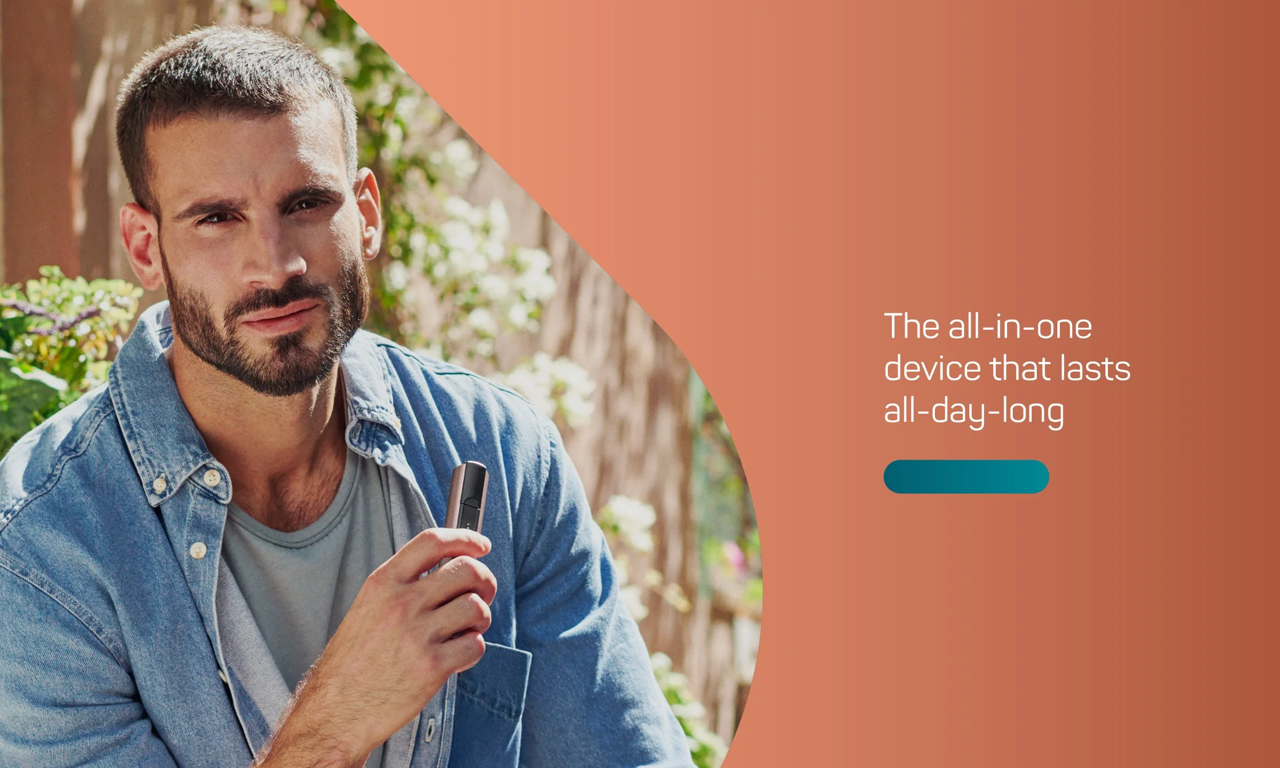
Imperial approached us to work on developing the end-to-end digital strategy for their heated tobacco brand Pulze. Initially launching the brand in Greece and the Czech Republic, it is later to be rolled out to further markets throughout the year.
Working as the lead designer on the team, my role was to evolve the current brand look & feel across multiple touchpoints. Primarily focusing on a complete website redesign, with further role out to social media, eCRM newsletters, digital banner ads, landing pages, print material and in-store video animation.
The global agency brand propositioning ‘Freedom in simplicity’ was the backbone for the creative exploration and what reshaped the online look and feel.
Throughout the program strategy, design and execution, I worked closely alongside Executive Creative Director James Hoxley and Associate Creative Director Michelle Connolly, as well as both the global and local market Imperial teams.
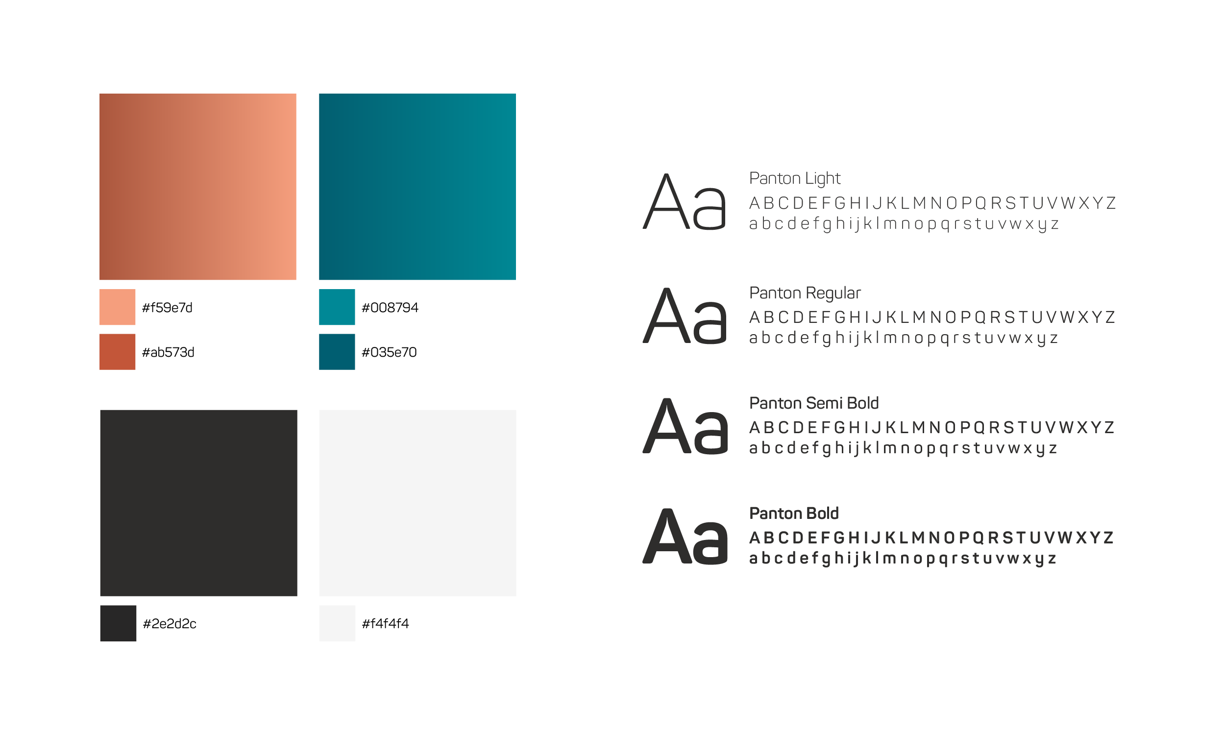
Swatches & Fonts
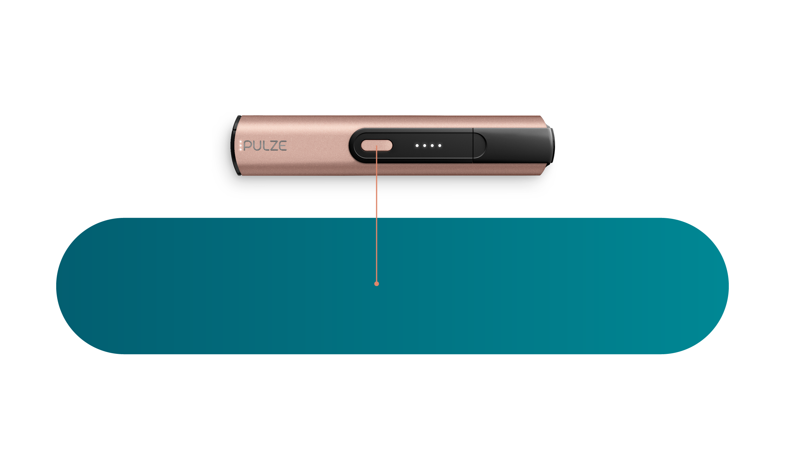
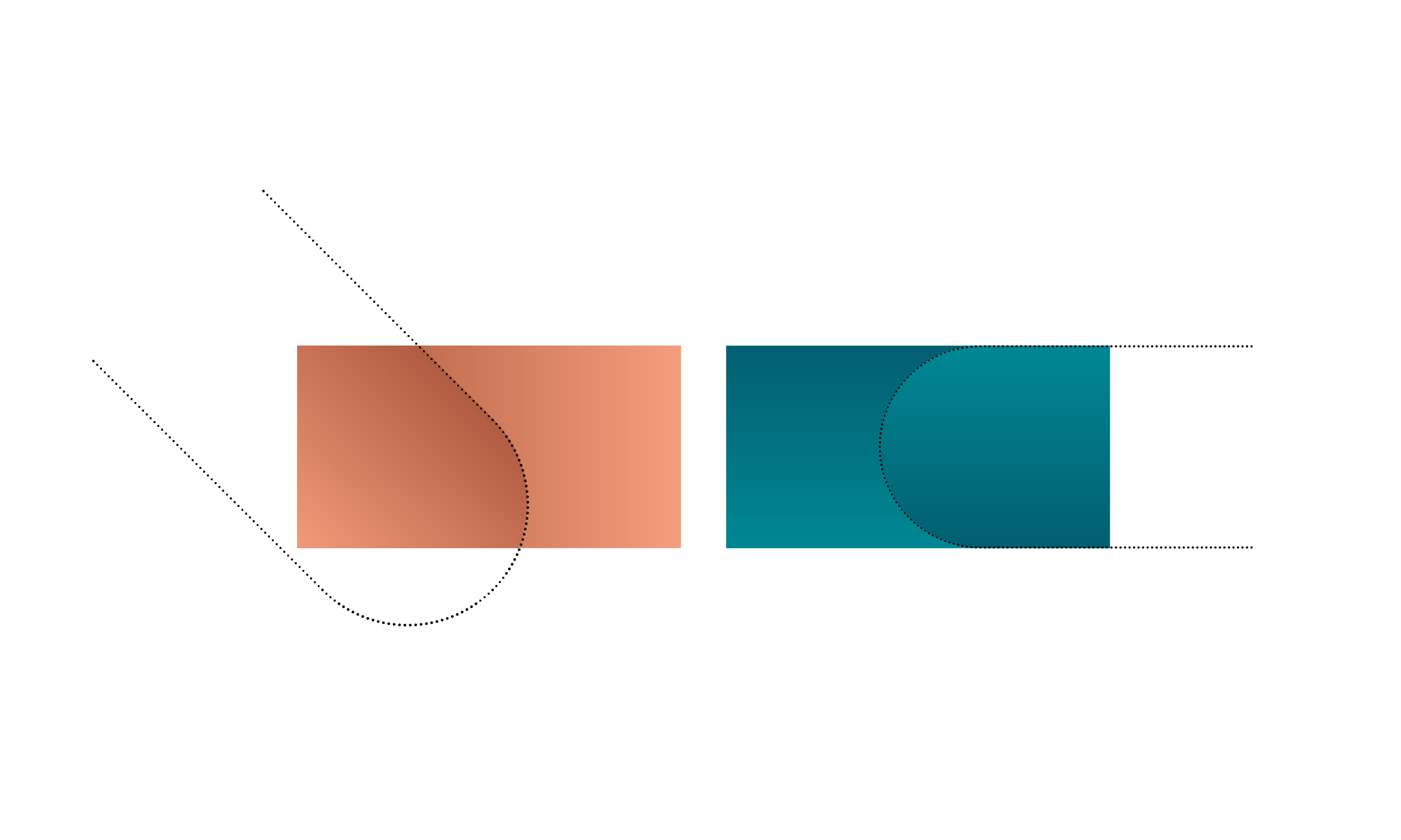
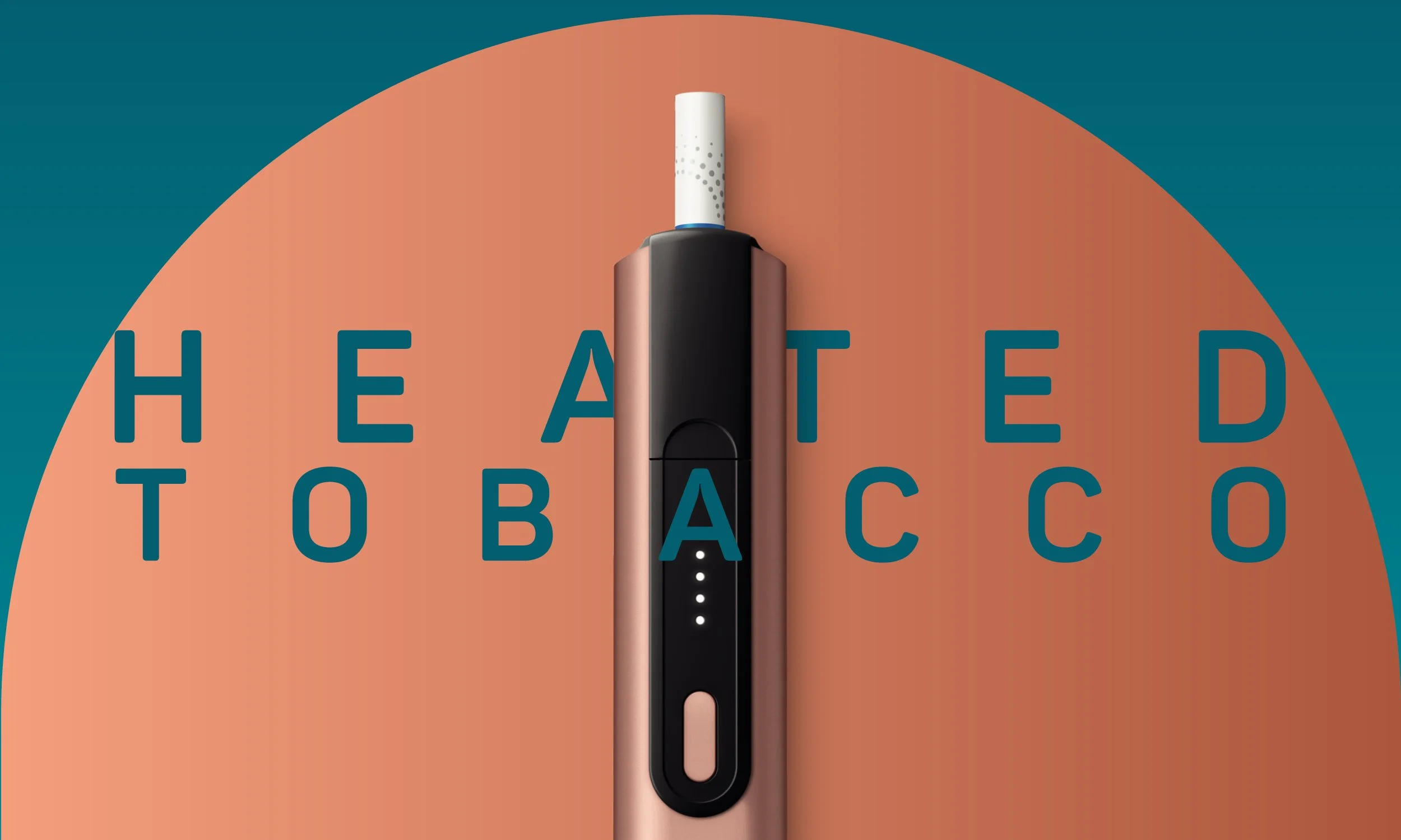
The skateboard Shape
The skateboard shape is fundamental to the visual identity. The shape is inspired by the device button. The skateboard shape is a strong brand asset that is integral to the digital ecosystem and integrates on and off-line communications.
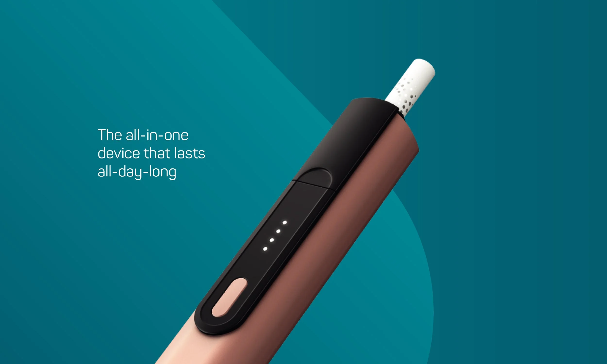
shape Integration
By using the ‘skateboard’ shape and the gradients from our brand colour palette we can build a dynamic design system.
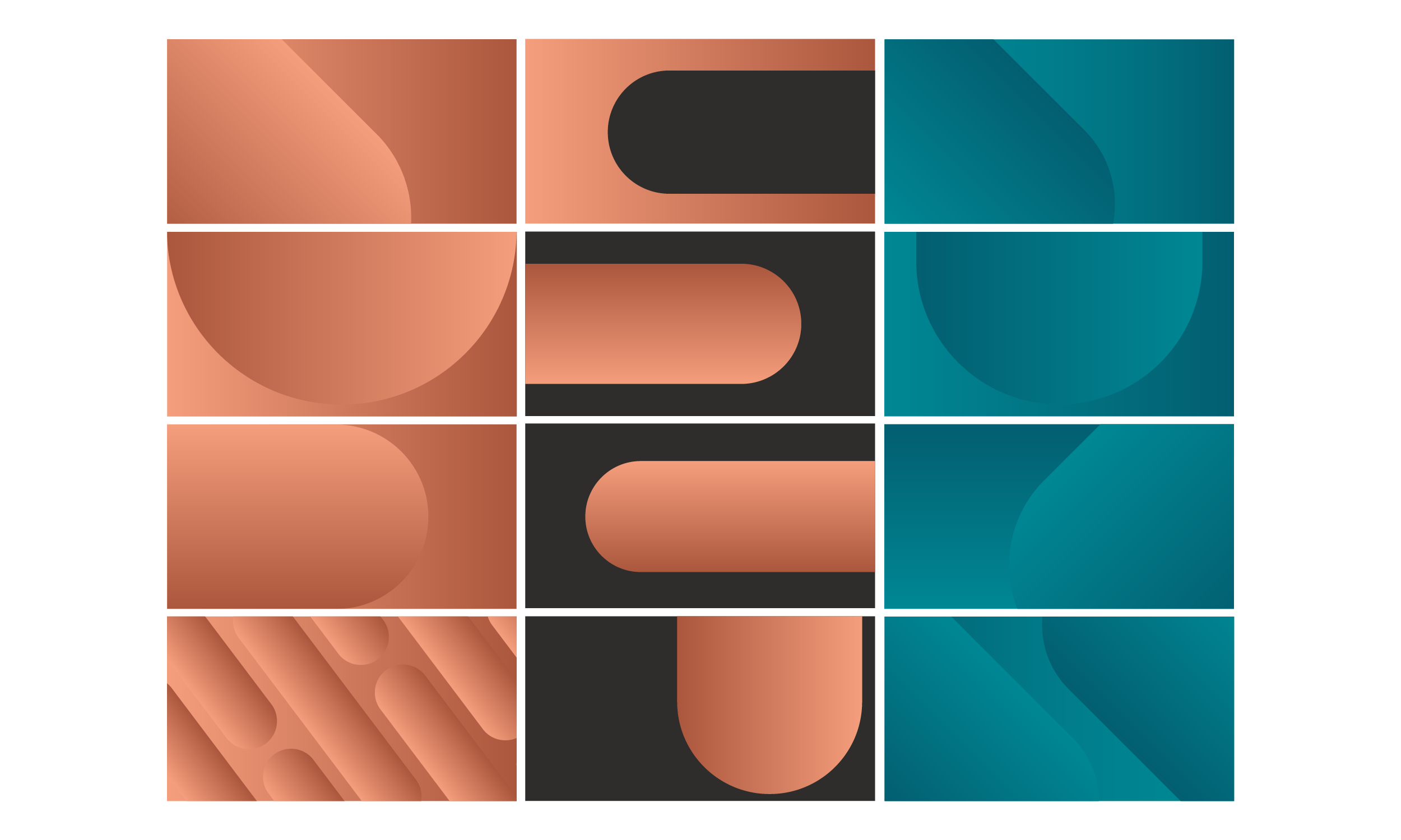
The Design System
By incorporating the core gradient colours into the skateboard shape and the background, we begin to develop an interesting brand world with no limits.
The design system is a great device for holding products, imagery and other information.
The design system creates a series of assets to be used across all digital touch points. It also creates a strong design language to use in retail through comms and fixtures.
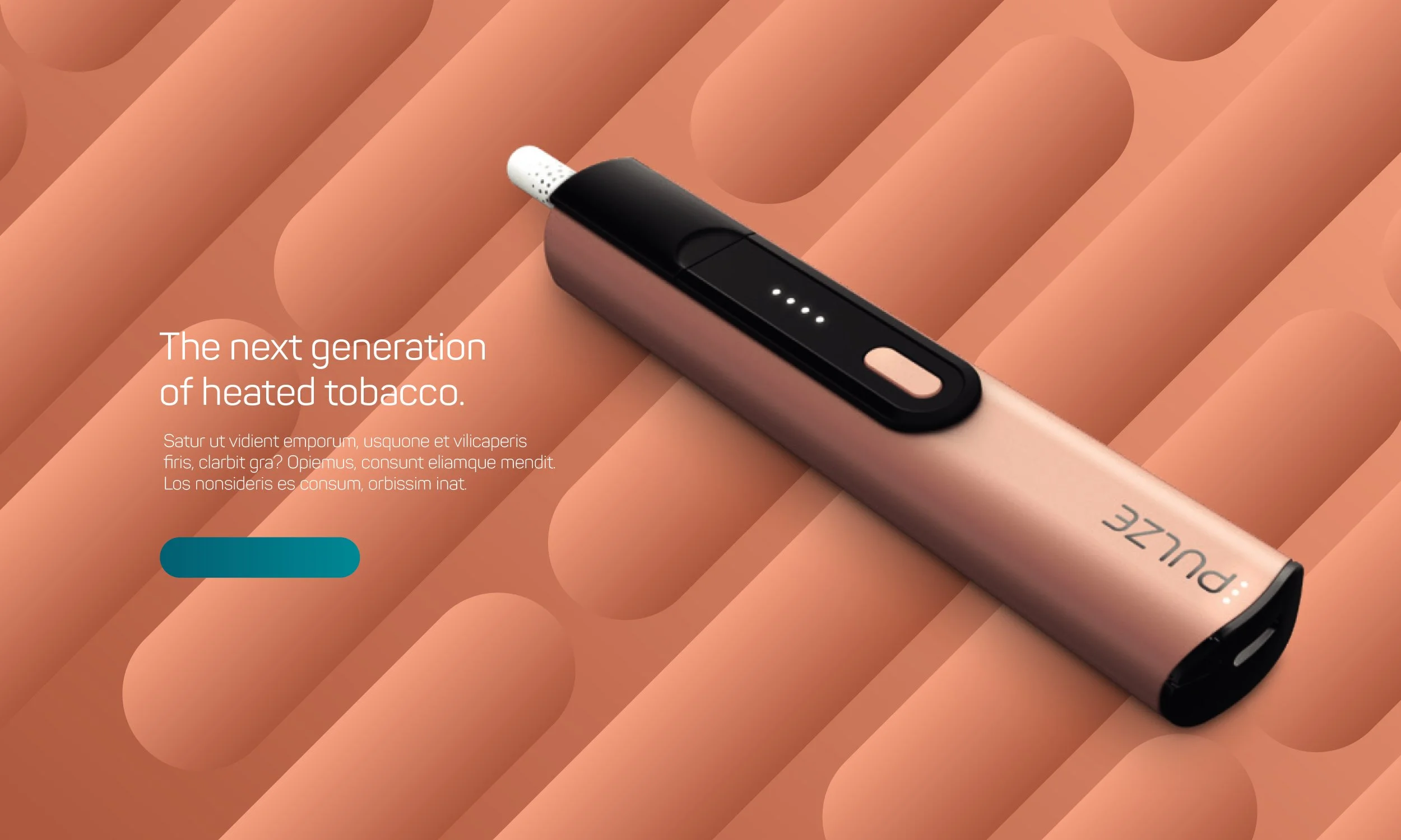
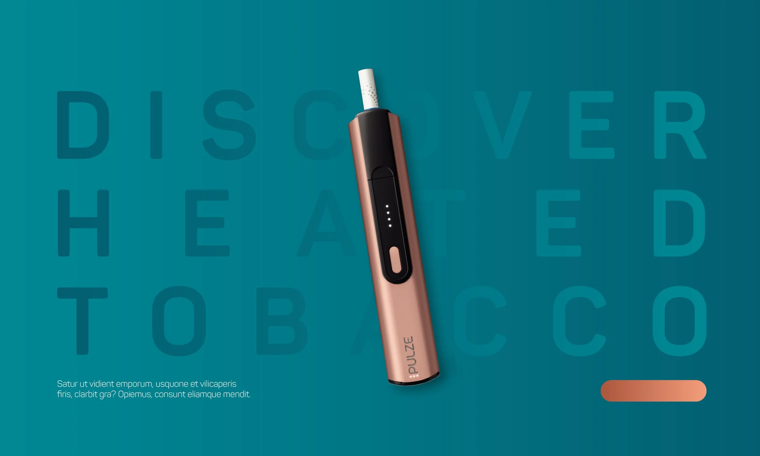
Key Art

Website
Working alongside a team of developers to translate the web design into a real working site, we used Figma to prototype each page and build a customer journey flow. Each page was designed for various formats, prioritising mobile, to help determine pixel perfect specs which are then used by the developers to build out the pages. The skateboard identity was weaved into various components throughout the website to keep consistent with the new look & feel. Website designs currently for both Greek and Czech markets

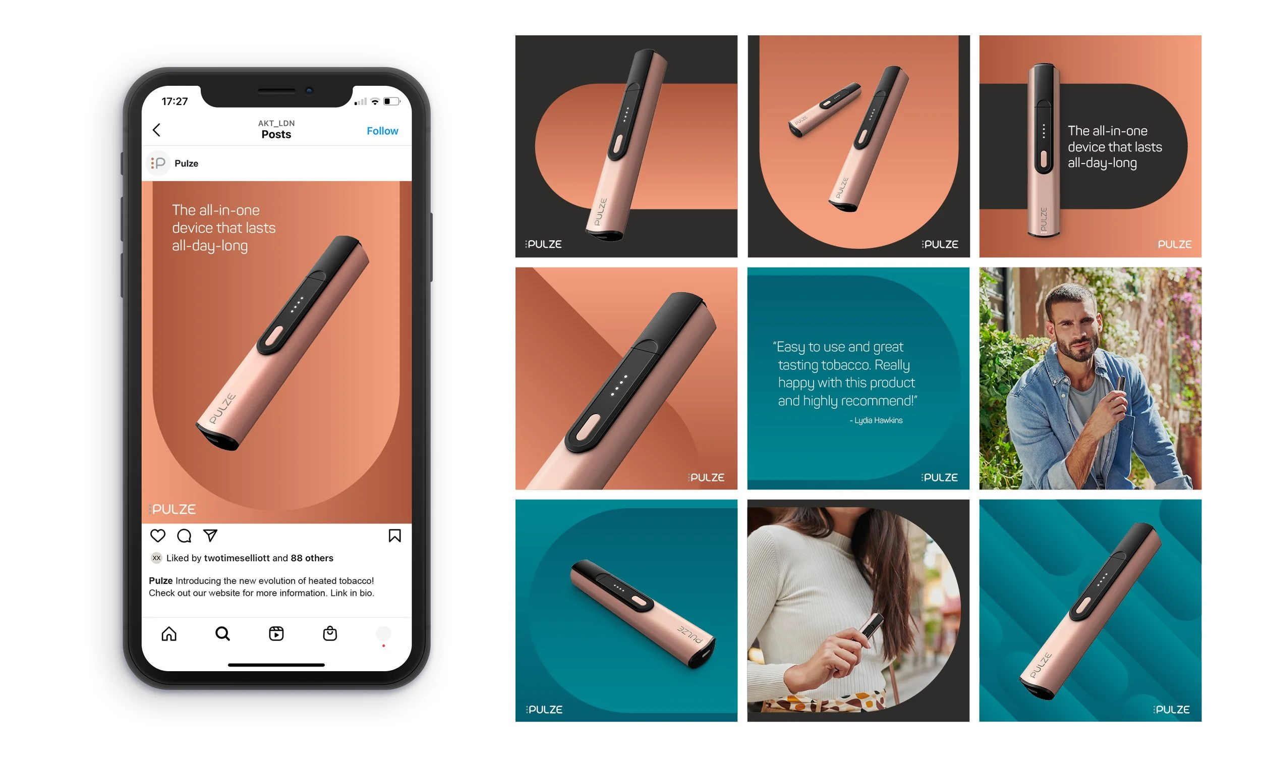
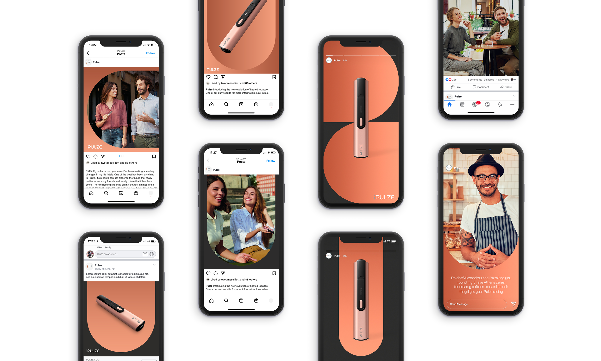
Social Media
Social media plays a huge role for Pulze by targeting their audience through paid ads and keeping them visually engaged on their social pages, through the use of static imagery and motion video. The social profiles for each market has been designed with the new look and feel in mind to give Pulze a solid online presence and to add maximum standout in feed.
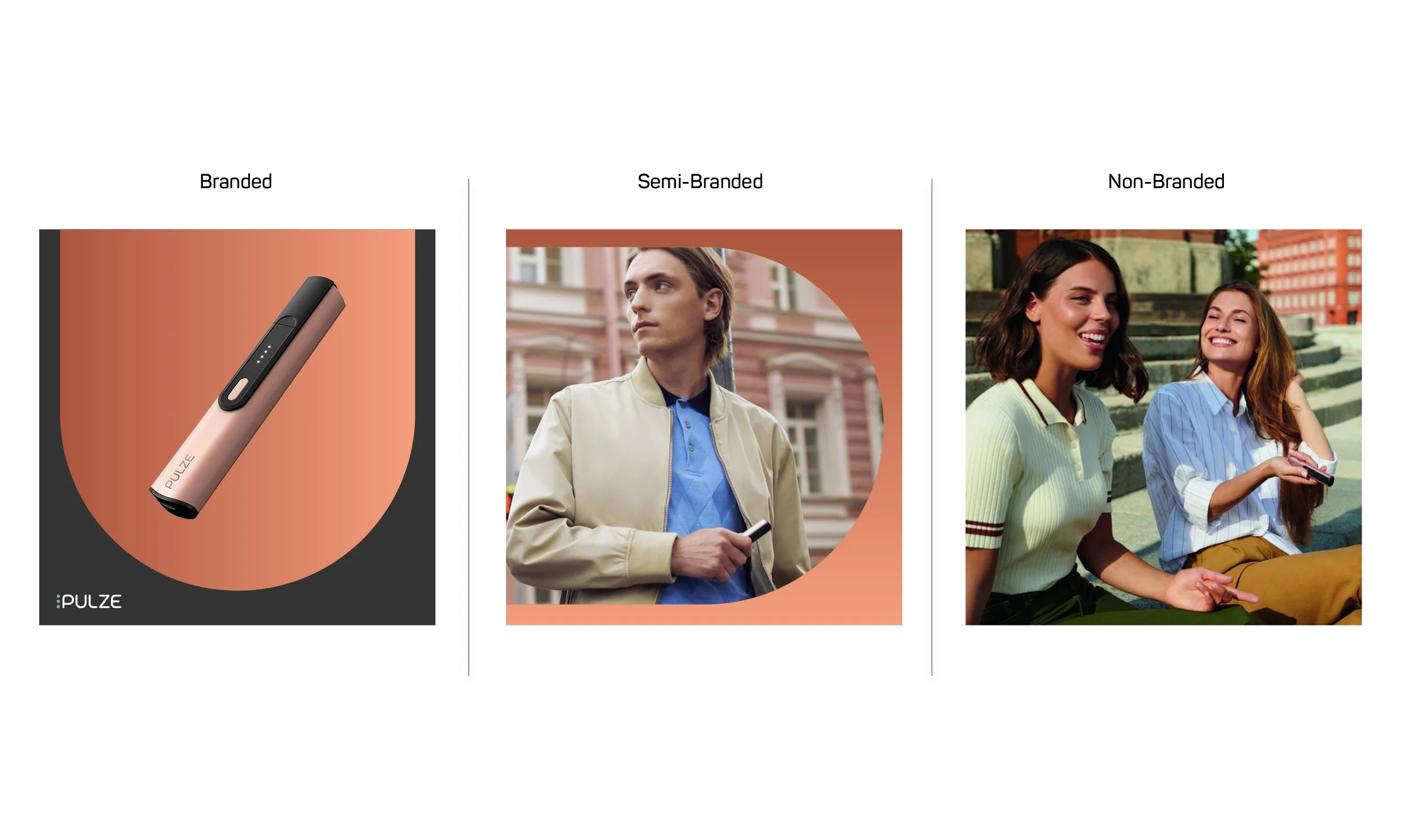
The social assets consist of 3 categories, branded, semi-branded and non-branded to allow for a flexible toolkit which can be adapted with ease.
Branded
This post is designed in the full brand visual identity.
The post will often featuring product or a headline.
Semi-branded
This post uses the Pulze skateboard shape to maintain an iconic link to the brand, whilst providing space for imagery.
Non-branded
This post features a full image with no additional branding. The image can feature a product in a lifestyle setting or convey an idea or message.
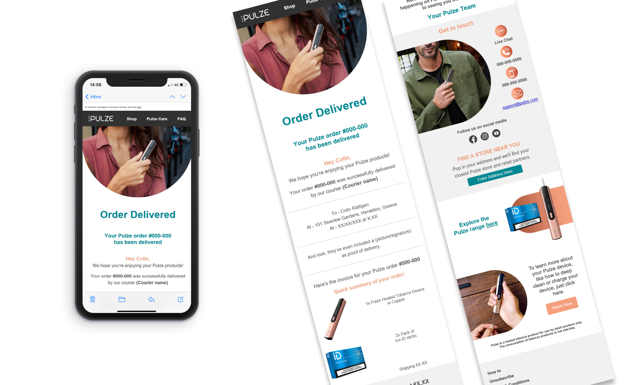
e-CRM
Pulze use a variety of newsletters to keep customers engaged with the brand and update them on the process of their order, using a series of follow-up emails. The newsletters are built in Optimove, using a simple build process. We have created a selection of custom assets to use within Optimove to help tie the newsletters to the brand ecosystem and keep in line with the new look & feel.